文字和字型,一直是門藝術,是很美的東西,很高興Max可以替「中華民國美學」盡分心力。
有一天遇到好心人(游清松)在分享他製作的免費授權字型,真的是大好人一枚,花這麼多時間,在做照福大眾的事情,Max在用過字型後,發現還滿好看的,於是想幫他做一個網站來推廣:
https://jasonfonts.max-everyday.com/
網站隨手點一點就完成了,大約花了一個晚上的時間就完成了上列的網站,但創作字型的作者目前沒打算使用,暫時算是做白工。
在使用某些字型時發現字太細,長像太斯文,希望可以有粗一點的版本,Max示範如何幫字型加字重。參考實際操用影片:
https://youtu.be/rQ56_CHcBs0
Step 1:先取得要處理的字型
Step 2:使用FontForge 開啟並另存新檔
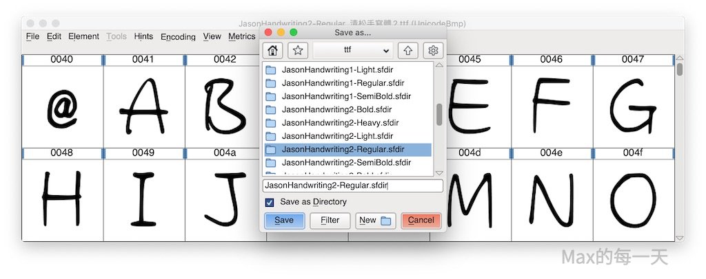
Step 3:執行調整字重的script
當然,也可以不要使用script(腳本)而是用滑鼠去點,用滑鼠很花時間,而且操作的步驟又很多,使用script(腳本)來操作重覆性高的事情,相對輕鬆一點。
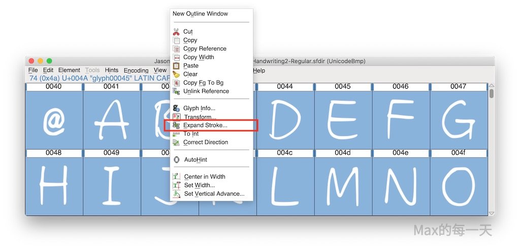
如果是手動點,不是透過script 請先「全選」所有字型後,按右鍵選「Expand Stroke…」即可取得調整字重後的字型。
FontForge script 官方的教學網址:
- Scripting FontForge
- https://fontforge.org/docs/scripting/scripting-alpha.html
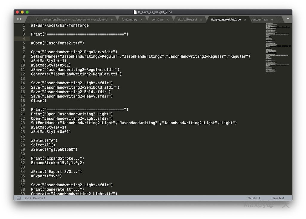
附上完整script:
!/usr/local/bin/fontforge
 Print("===================================")
 Open("JasonHandwriting2-Regular.sfdir")
 SetFontNames("JasonHandwriting2-Regular","JasonHandwriting2","JasonHandwriting2-Regular","Regular")
 Generate("JasonHandwriting2-Regular.ttf")
 Save("JasonHandwriting2-Light.sfdir")
 Save("JasonHandwriting2-SemiBold.sfdir")
 Save("JasonHandwriting2-Bold.sfdir")
 Save("JasonHandwriting2-Heavy.sfdir")
 Close()
 Print("===================================")
 Print("Open JasonHandwriting2 Light")
 Open("JasonHandwriting2-Light.sfdir")
 SetFontNames("JasonHandwriting2-Light","JasonHandwriting2","JasonHandwriting2-Light","Light")
 SelectAll()
 Print("ExpandStroke…")
 ExpandStroke(15,45,15,15,0,2)
 Save("JasonHandwriting2-Light.sfdir")
 Print("Generate ttf…")
 Generate("JasonHandwriting2-Light.ttf")
 Close()
 Print("Close JasonHandwriting2 Light")
 Print("===================================")
 Print("Open JasonHandwriting2 Medium")
 Open("JasonHandwriting2-Medium.sfdir")
 SetFontNames("JasonHandwriting2-Medium","JasonHandwriting2","JasonHandwriting2-Medium","Medium")
 SetMacStyle(-1)
 SetMacStyle(0x01)
 Print("ExpandStroke…")
 SelectAll()
 ExpandStroke(12,45,12,12,0,1)
 Save("JasonHandwriting2-Medium.sfdir")
 Print("Generate ttf…")
 Generate("JasonHandwriting2-Medium.ttf")
 Close()
 Print("Close JasonHandwriting2 Medium")
 Print("===================================")
 Print("Open JasonHandwriting2 SemiBold")
 Open("JasonHandwriting2-SemiBold.sfdir")
 SetFontNames("JasonHandwriting2-SemiBold","JasonHandwriting2","JasonHandwriting2-SemiBold","SemiBold")
 SetMacStyle(-1)
 SetMacStyle(0x01)
 Print("ExpandStroke…")
 SelectAll()
 ExpandStroke(24,45,24,24,0,1)
 Save("JasonHandwriting2-SemiBold.sfdir")
 Print("Generate ttf…")
 Generate("JasonHandwriting2-SemiBold.ttf")
 Close()
 Print("Close JasonHandwriting2 SemiBold")
 Print("===================================")
 Print("Open JasonHandwriting2 Bold")
 Open("JasonHandwriting2-Bold.sfdir")
 SetFontNames("JasonHandwriting2-Bold","JasonHandwriting2","JasonHandwriting2-Bold","Bold")
 SetMacStyle(-1)
 SetMacStyle(0x01)
 Print("ExpandStroke…")
 SelectAll()
 ExpandStroke(34,45,34,34,0,1)
 Save("JasonHandwriting2-Bold.sfdir")
 Print("Generate ttf…")
 Generate("JasonHandwriting2-Bold.ttf")
 Close()
 Print("Close JasonHandwriting2 Bold")
FontForge 的說明:
ExpandStroke(width)
ExpandStroke(width,line cap, line join)
ExpandStroke(width,line cap, line join,0,removeinternal /external flag)
ExpandStroke(width,calligraphic-angle,height-numerator,height-denom)
ExpandStroke(width,calligraphic-angle,height-numerator,height-denom, 0, remove internal/external flag)
In the first format a line cap of “butt” and line join of “round” are implied.
A value of 1 for remove internal/external will remove the internal contour, a value of 2 will remove the external contour.
The first three calls simulate the PostScript “stroke” command, the two final simulate a caligraphic pen.
- Width
In the PostScript “stroke” command the width is the distance between the two generated curves. To be more precise, at ever point on the original curve, a point will be added to each of the new curves at width/2 units as measured on a vector normal to the direction of the original curve at that point.
In a caligraphic pen, the width is the width of the pen used to draw the curve. - Line-cap
Can have one of three values:
0=> butt,
1=>round,
2=>square - Line-join
Can have one of three values:
0=>miter,
1=>round,
2=>bevel - caligraphic-angle
the (fixed) angle at which the pen is held. - height-numerator/denominator
These two values specify a ratio between the height and the width
height = numerator * width / denominator
(the scripting language only deals in integers, so when fractions are needed this kludge is used) - remove internal/external contour flags
1 => remove internal contour
2=> remove external contour
(you may not remove both contours)
4 => run remove overlap on result (buggy)
實際測試,使用參數愈少的,問題愈多!建議使用最後一組,參數很多的,我幫大家把參數加粗。
使用最後一組的缺點是,Line Join 會使用 Bevel 很醜!不能接受 Bevel 請改用
ExpandStroke(width,line cap, line join,0,removeinternal /external flag)
範例:
ExpandStroke(15,1,0,0,1)
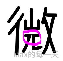
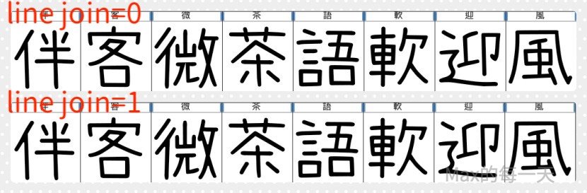
大多的情況都是很難二全其美,在使用 line join=0 可以讓文字在變細時,比較銳利,問題是也可能變成這樣子,「微」字就開叉了:
折衷的方案是使用 join join=1 ,讓筆畫間有渲染的感覺,會略醜,但問題較少 T_T。
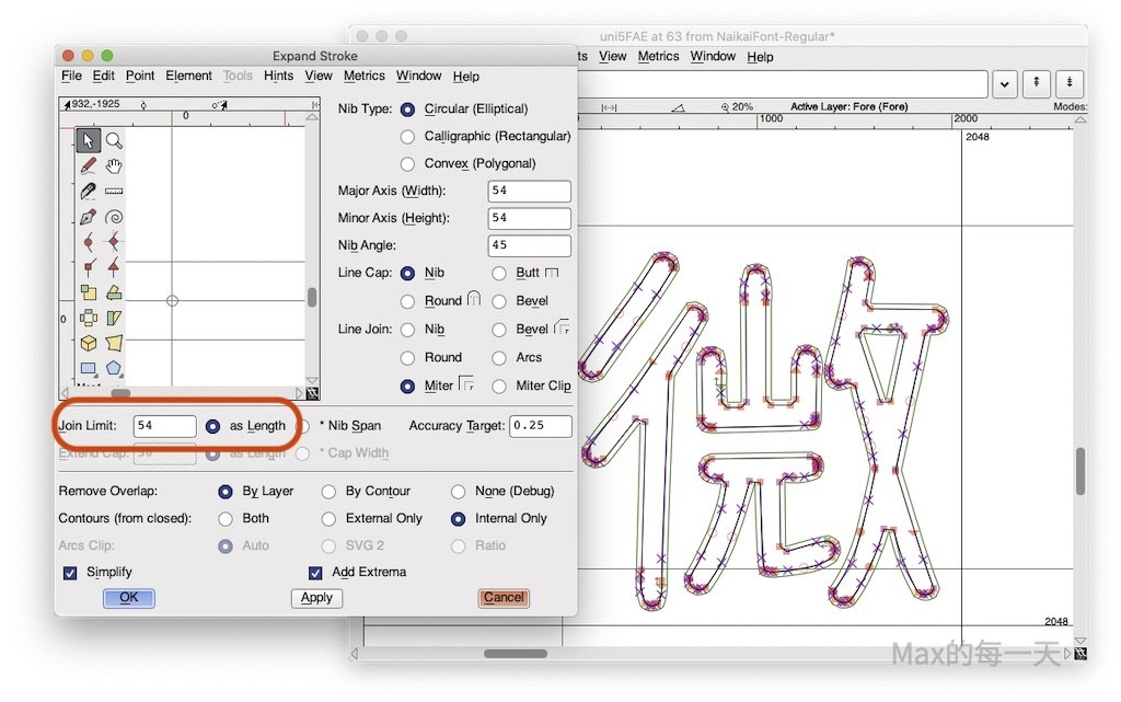
最佳解法是使用 Join Limit as Legnth
更多的 stroke() 範例:
https://github.com/fontforge/fontforge/blob/1cd85a0e621352f81aca07bf9eb42467ee078f38/tests/test1003.py
附註:上面的範例,要使用新的版本才能使用。Max 用的 stroke 是:
glyph.stroke("circular",54,cap="round",join="miter",angle=math.radians(45),removeexternal=True,simplify=True,joinlimit=6)
針對使用上面會掛掉的字,改用下面這組就 OK 了:
glyph.stroke("circular",54,cap="round",join="miter",removeexternal=True,simplify=True)
主要差在,angle=math.radians(45),有些字可以使用,有些字不行。
完整的程式碼,放在這一個網頁裡:
FontForge script debug
http://stackoverflow.max-everyday.com/2020/03/fontforge-script-debug/
建議使用「較新」版本的FontForge 執行檔來處理,可能錯誤會較少。如果是使用macOS 可以試看看在 .pe 檔案裡,最上面使用這一行:
#!/Applications/FontForge.app/Contents/Resources/opt/local/bin/fontforge
開發者的版本(Development builds):
http://dl.bintray.com/fontforge/fontforge/
開發者的版本,不是萬能的,雖然解決掉一些字在 expand stroke 時會亂掉的問題,但相對不太隱定,有較高的機率程式會卡住,卡住有可能是(1)程式完全沒回應,也可能是(2)顯示有錯就關閉掉程式(閃退)。
「Correct Direction」 有可能會造成字型檔被改壞掉,使用「全選」來做這一個功能,可能會有不具名的字會改壞掉。
但是!有些字型裡,還沒有去使用「Correct Direction」功能,產生出來的方向就已經出問題了,又不可能一個一個字去檢查,到底修改字重後,會放大還是縮小。結論:用與不用,都很難選。
最後Max還是決定都使用,因為這樣比較方便用來做其他字體樣式的處理,透過使用Correct Direction,大多的「點」會被重新排序,方便做處理。
如果遇到在 Expand stroke 時,方向錯誤的區塊,就是預期應該變細,但是卻變粗了的情況,請使用一下 Correct Direction,如果還是無法解決,最佳解法是使用匯出(export)功能匯出該字為 svg 格式,再把 fontforge 裡的線條都清空,透過匯入(import)功能匯入該字的 svg 檔案,通常就不會有問題。
為什麼會講到開發者版本,參考看看:
莫大毛筆字體的調整 ver 1.30
https://max-everyday.com/2020/03/bakudaifont-ver-1-30/
除了透過 FontForge script 來改字重,也可以透過 python script , 可以操控的變數更多,功能也更多。
https://fontforge.org/docs/scripting/python/fontforge.html#module-functions
glyph.stroke(“circular”, width[, CAP, JOIN, FLAGS])glyph.stroke(“elliptical”, width, minor_width, ANGLE[, CAP, JOIN, FLAGS])glyph.stroke(“calligraphic”, width, height, angle[, FLAGS])glyph.stroke(“polygon”, contour[, FLAGS])(Legacy interface)glyph.stroke(“circular”, width[, CAP, JOIN, ANGLE, KEYWORD])glyph.stroke(“elliptical”, width, minor_width[, ANGLE, CAP, JOIN, KEYWORD])glyph.stroke(“calligraphic”, width, height[, ANGLE, CAP, JOIN, KEYWORD])glyph.stroke(“convex”, contour[, ANGLE, CAP, JOIN, KEYWORD])(Current interface)
Strokes the contours of the glyph according to the supplied parameters. See the stroke documentation for a more complete description of the facility and its parameters.
A "circular" nib just has a width (the diameter), while an "elliptical" nib has a width (major axis) and a minor_width (minor axis). A "calligraphic" or "rectangular" nib is similar in that it has a width and a height. Finally a "convex" nib is one supplied by the user as a fontforge.contour or fontforge.layer. It must be convex as defined in the main stroke facility documentation.
ANGLE is optional. It can be specified either positionally or with angle=float. It must be a floating point number in units of radians and defaults to zero. The nib is rotated by this angle before stroking the path.
CAP is optional. It can be specified either positionally or with cap=string. It must be one of the strings “nib” (the default), “butt”, “round”, and “bevel”.
JOIN is optional. It can be specified either positionally or with join=string. It must be one of the strings “nib” (the default), “bevel”, “miter”, and “miterclip”, “round”, and “arcs”.
KEYWORD Parameters:removeinternal (boolean, default=False)
When a contour is closed and clockwise, only the smaller “inside” contour is retained. When a contour is closed and counter-clockwise only the larger “outside” contour is retained.removeexternal (boolean, default=False)
When a contour is closed and clockwise, only the larger “outside” contour is retained. When a contour is closed and counter-clockwise only the smaller “inside” contour is retained.extrema (boolean, default=True)
When true, any missing extrema on the stroked paths are added.simplify (boolean, default=True)
When true, simplify is called on the path before it is returned. The error-bound is set to the accuracy value.removeoverlap (string, default="layer")
Specifies whether, and on what basis, remove-overlap should be run. “layer” corresponds to running remove-overlap on the layer as a whole. “contour” corresponds to running remove-overlap on individual contours. “none” corresponds to not running remove-overlap. Note that because the stroke facility relies on remove-overlap to eliminate cusps and other artifacts, “none” is an unusual choice and available primarily for debugging purposes.accuracy (float, default=0.25)
This is a target (but not a guarantee) for the allowed error, in em-units, of the output relative to the input path and nib geometries. Higher values allow more error will typically yield contours with fewer points.jlrelative (boolean, default=True)
See below.joinlimit (float, default=20)
Specifies the maximum length of a “miter”, “miterclip”, or “arcs” join. For “miter” joins that would be longer will fall back to “bevel”. With “miterclip” and “arcs” a longer join will be trimmed to the specified length. Note, however, that no join is trimmed past the “bevel line” and therefore lower values do not guarantee a given length.
When jlrelative is false the value is interpreted as a length in em-units. Otherwise the value is interpreted as a multiple of “stroke-widths”: the average of the spans of the nib at the incoming and outgoing join angles.ecrelative (boolean, default=True)
See below.extendcap (float, default=0)
When the contour being stroked is open and the cap style is “butt” or “round”, this parameter adds area between the end of that contour and the cap. The length of that area will never be less than the specified value but may be more, depending on the geometry of the nib and the join. (However, it will always be exact for circular nibs.)
When ecrelative is false the value is interpreted as a length in em-units. Otherwise the value is interpreted as a multiple of “stroke-widths”: the span of the stroked path at the angle at the cap.arcsclip (string, default="auto")
When using the “arcs” join style this parameter influences the algorithm used to clip joins that exceed the joinlimit. The value “svg2” specifies the standard SVG algorithm while the value “ratio” specifies an alternative algorithm that works better for longer and thinner nibs at shorter limits. The default value “auto” chooses the “ratio” algorithm for oblong elliptical and calligraphic nibs and jlrelative joinlimit < 4 and the “svg2” algorithm otherwise.
In the legacy interface, FLAGS is an optional tuple containing zero or more of the strings “removeinternal”, “removeexternal”, and “cleanup”. The last is interpreted as simplify=True, with a default of False when a FLAGS tuple is present.
補充說明:
- 上面的例子,可以在Windows/macOS/Linux平台上使用。
- 非開源的字型檔,自行編修沒有辦法被得知,但公開發佈也許會有法律上的問題。
- 不是所有的字型都可以使用。
- 透過程式調整筆劃可能會失敗,字可能會被改壞掉。
- 有些字型需要先使用Select All,再用 Correct Direction 調整方向,才不會造成調整的結論是:有些字變粗,有些字變細。
- 透過程式調整筆劃,只能調整粗細無法調整間距,所以有些字會因為調粗而變的太擠,或跟下一個字會相連在一起。
- 沒有任何一個字型編輯軟體能確保重新儲存的字型檔跟原始檔一模一樣。編修後的字型檔,很有可能會有kerning數值跑掉、直排字符異常或各種問題。
- 有空多看些英文的網站也滿好的,練習一下英文。
相關文章:
幫字型檔補缺字
https://max-everyday.com/2020/02/how-to-add-new-glyph-to-font/
免費商用字體整理
https://max-everyday.com/2020/02/free-commercial-fonts/
比較不同字形檔之間的缺字差異:
https://max-everyday.com/2020/02/font-glyph-set-compare/
FontForge 調整字型在 Windows 的安裝顯示名稱
https://stackoverflow.max-everyday.com/2020/02/fontforge-chinese/